
Conversations
The Conversations screen answers a different question from Workflow. Workflow shows the static shape — where a type can flow. Conversations shows what actually happened to one concrete message instance: the real chain of sends, receives, and handler executions that one request set off across your services, drawn as a causal graph or a timeline.
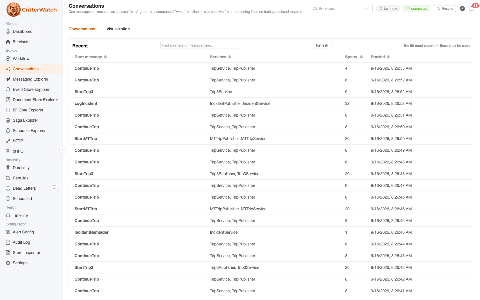
Reach it from the Explore → Conversations sidebar item (/conversations).
No tracing backend required. The feed is captured first-class from Wolverine's own
ActivitySourceinside each monitored service and pushed to CritterWatch. You do not need to bind an OpenTelemetry provider, run Jaeger, or configure anything — if a service is monitored, its conversations show up. Capture is bounded (a rolling retention window), so this is a live operational view, not a long-term trace archive.
Two tabs, each the full width
The screen is split into two tabs rather than two panes:
- Conversations — the list of what has been captured.
- Visualization — the selected conversation, drawn.
Both halves are wide things: the list carries service names that a narrow pane broke mid-word, and the causal graph is the widest artefact in the console. Clicking a row opens it on the Visualization tab; Back to the list returns. The Visualization tab names the conversation you came from — root message, services, spans, start — so a tab away from the list never loses track of what is on screen.
The Conversations tab
The list shows the most-recently-active conversations, newest first. Each row shows:
- Root message — the type that started the conversation (short name), with a red failed tag if any hop in it errored.
- Services — every service the conversation touched.
- Spans — how many spans were captured. Not the same number as the message count the Visualization tab shows: one message produces a send, a receive and an execute span, so this is the larger figure. Hover the column header for the same note.
- Started — when the first span fired.
Sort by any column; the sort ranks the whole set, not the page you are looking at. Use the Find a service or message type… box to narrow the list, and Refresh to re-pull it.
The list is capped at the 50 most recent conversations, and says so beneath the grid when it is at the cap: "the 50 most recent — there may be more." Capture is a rolling window, so what is on this screen is what the console still holds — a live operational view, not an archive.
Reading one conversation — Why vs. When
The Visualization tab renders the selected conversation two ways, via the Why / When toggle:
Why — the causal graph
The default view is a causal "why" graph (ServiceInsight-style) on the same Vue Flow substrate the Workflow screen uses. Each box is a message envelope; caused-by arrows connect a message to the messages it triggered. Failed hops render red, and a saga participant is badged. This is the view for "this request went wrong — what led to the failure, and what did it set off?"
When — the compacted timeline
The "when" timeline is a compacted, Temporal-style Gantt: one bar per envelope from start to finish, coloured by outcome, with the waits between bars shown as real gap markers. This is the view for "where did the time go?" — especially for flows with scheduled/delayed steps, where the gaps are the story.
Recovering a failed message inline
On the Visualization tab, when a message failed and was dead-lettered, click its red box (Why view) or its row (When view). If that envelope has a captured dead-letter identity, a small action bar appears offering Replay and Discard. These reuse the exact same DlqOperation machinery as the Dead Letter Queue screen — the command travels the normal SignalR path, so recovering a poison message never leaves the conversation you're looking at.
Cross-linking with the Workflow graph
Conversations and the Workflow flow graph are wired together in both directions:
- Show on workflow map — the button in a conversation's header opens the Workflow screen with this conversation's exact path lit across the static graph (everything off the path dims), so you can see the concrete run against the whole modelled shape.
- Coming the other way, clicking an edge on the Workflow flow graph opens a drawer of the real conversations that actually traversed it; each entry opens that conversation here.
How one conversation is stitched together
A single logical flow does not always stay one distributed trace. When a message crosses the async projection boundary — an event is appended, then a projection publishes a downstream message — the runtime starts a new trace. If CritterWatch keyed conversations on the W3C trace id alone, one business flow would shatter into disconnected fragments.
Instead, conversations key on Wolverine's CorrelationId, which propagates across that boundary, so the whole flow reassembles into one conversation. Where a causal edge genuinely can't cross the boundary (only a span-parent id exists, not a causation-message id), the link is drawn as an inferred, time-ordered dashed edge rather than asserted as fact — honest about what was observed versus what was reconstructed.